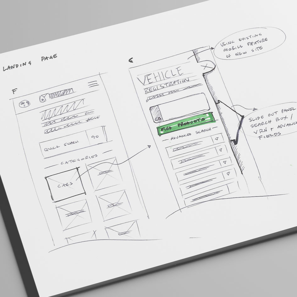
London and Boston based agency The Digital Quarter – specialists in digital transformation and Digital Business Optimisation, invited us to partner with them on a brief from their Client PETRONAS Lubricants International (PLI) to redesign their online Lubrication recommendation Tool.
The previous lube recommender tool, the most visited digital tool on the site, suffered from an experience that was lengthy with consumers being asked to supply too much information to obtain a ‘Hero’ recommendation.
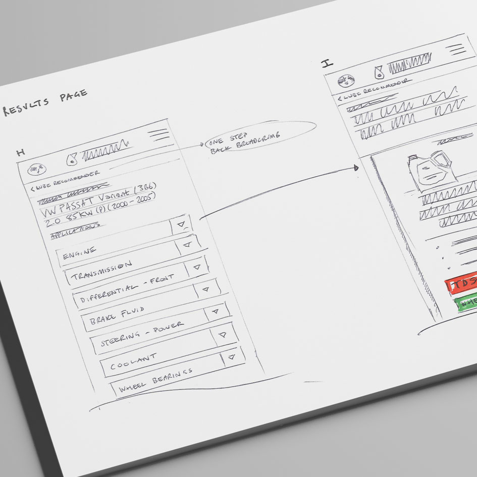
Our brief was to streamline the customer journey ensuring the users get a ‘hero’ engine oil recommendation quickly, showcasing additional product recommendations and driving PLI audiences closer to the point of purchase.
TDQ’s in-house web development team built the final tool.
Research
UX Workshops
Mapping Customer Journeys & Wireframes
Low Fidelity Prototyping
User Testing Sessions
High Fidelity Mobile and Desktop Responsive Design
Mapping out the User Journey
Rapid UX sketching exploring options to simplify the consumer journey
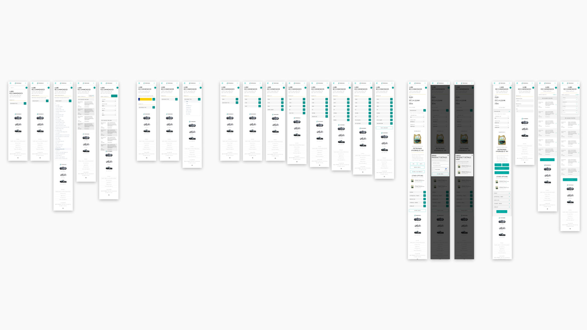
Screen layouts for each step of the journey
Initial Interactive Prototype for testing the experience
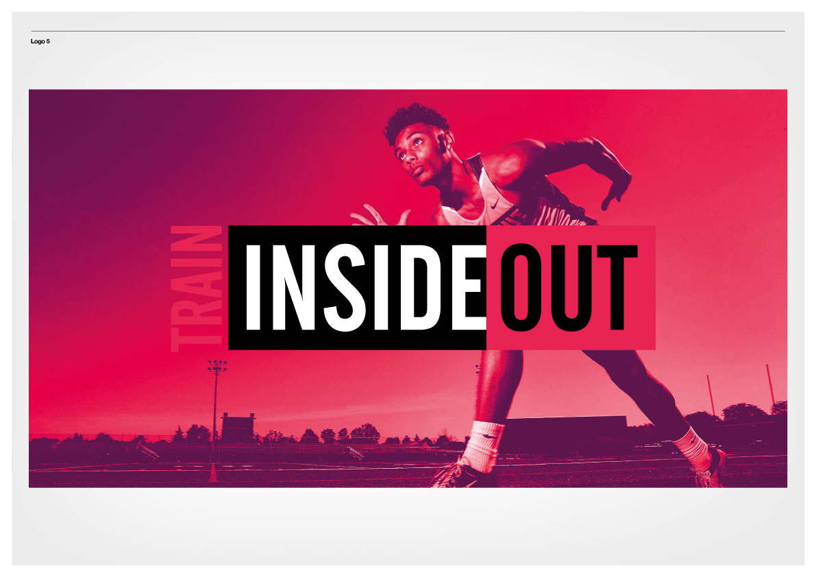
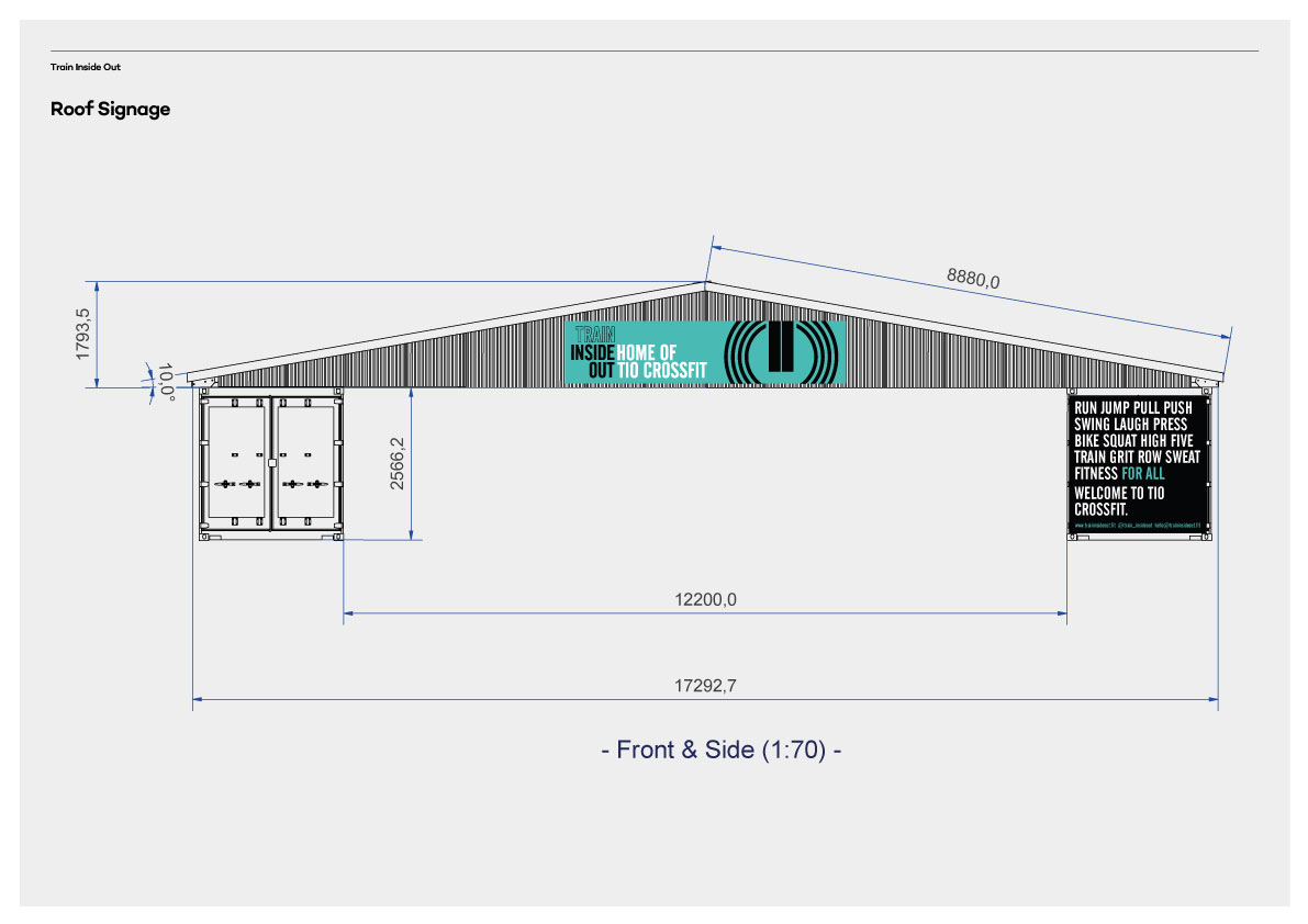
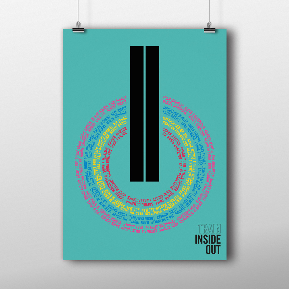
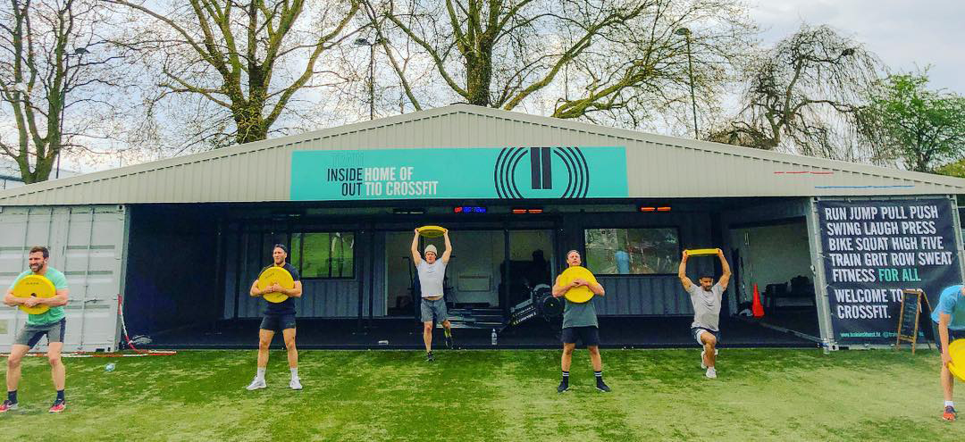
Familiar with our branding work for Blitz, Holly Hammill Founder and Head Coach of Train Inside Out, approached Studio 6ix with a novel concept – to build London’s first gym constructed from shipping containers! Instantly excited about this unique concept we jumped at the chance of working with Holly to bring her idea to life.
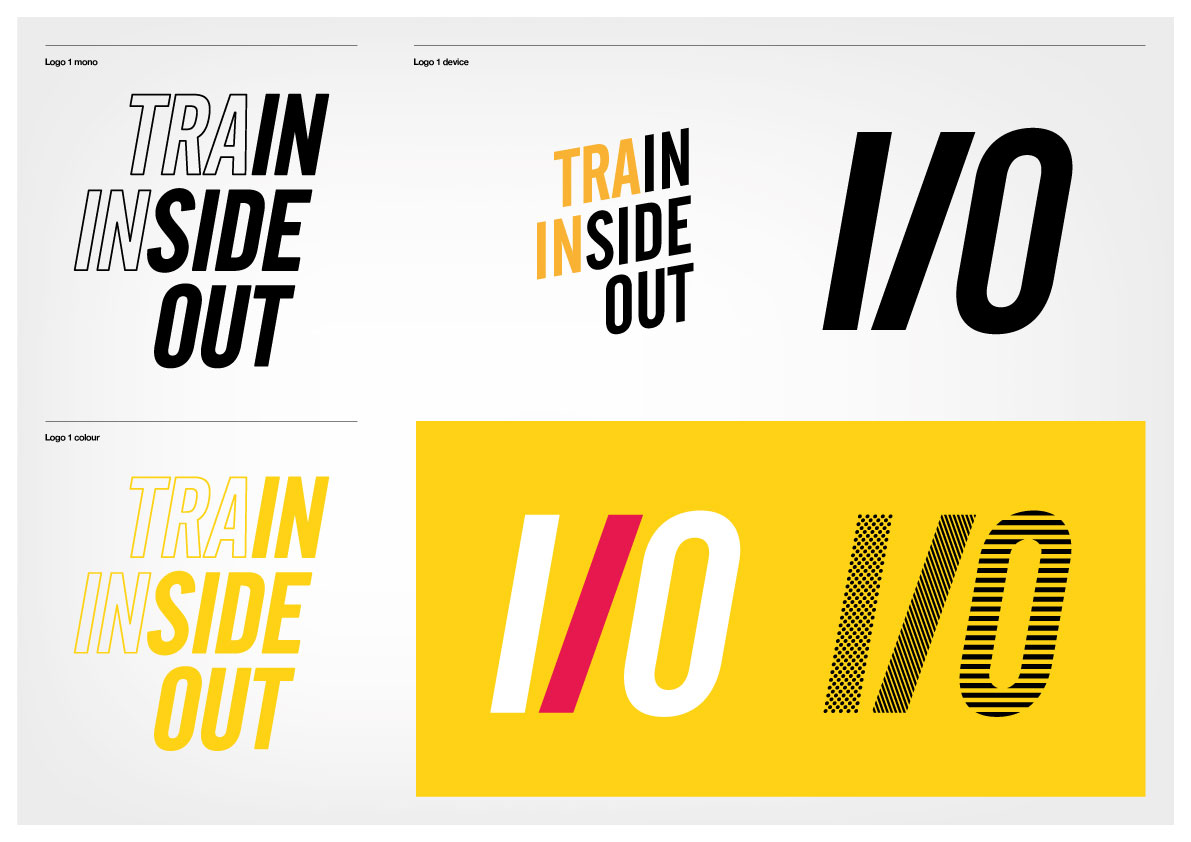
After completing some initial research, and working with Holly through our 12-step brand process, we first defined the audience and developed a name for the brand; from dozens of names we shortlisted three, Train Inside Out, METTL and Protean, after testing out these names we settled on Train Inside Out or TIO for short.
We defined the brands purpose as: “Making people stronger, faster, fitter and feeling awesome from the inside out.“
With a strong set of brand values including Integrity, Confidence, Inspiring, Committed, Collaborative, Passionate and Sustainable.
Concept Workshops
Brand Development
Brand Strategy
Identity Design
Identity Implementation
User Experience Design
User Interface Design
Website Design and Build
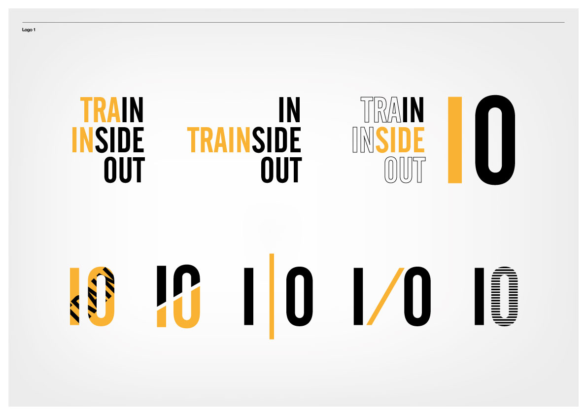
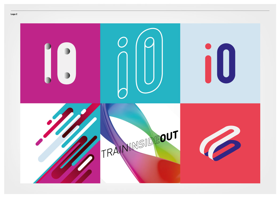
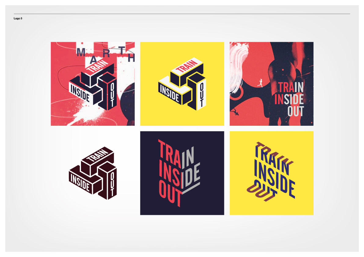
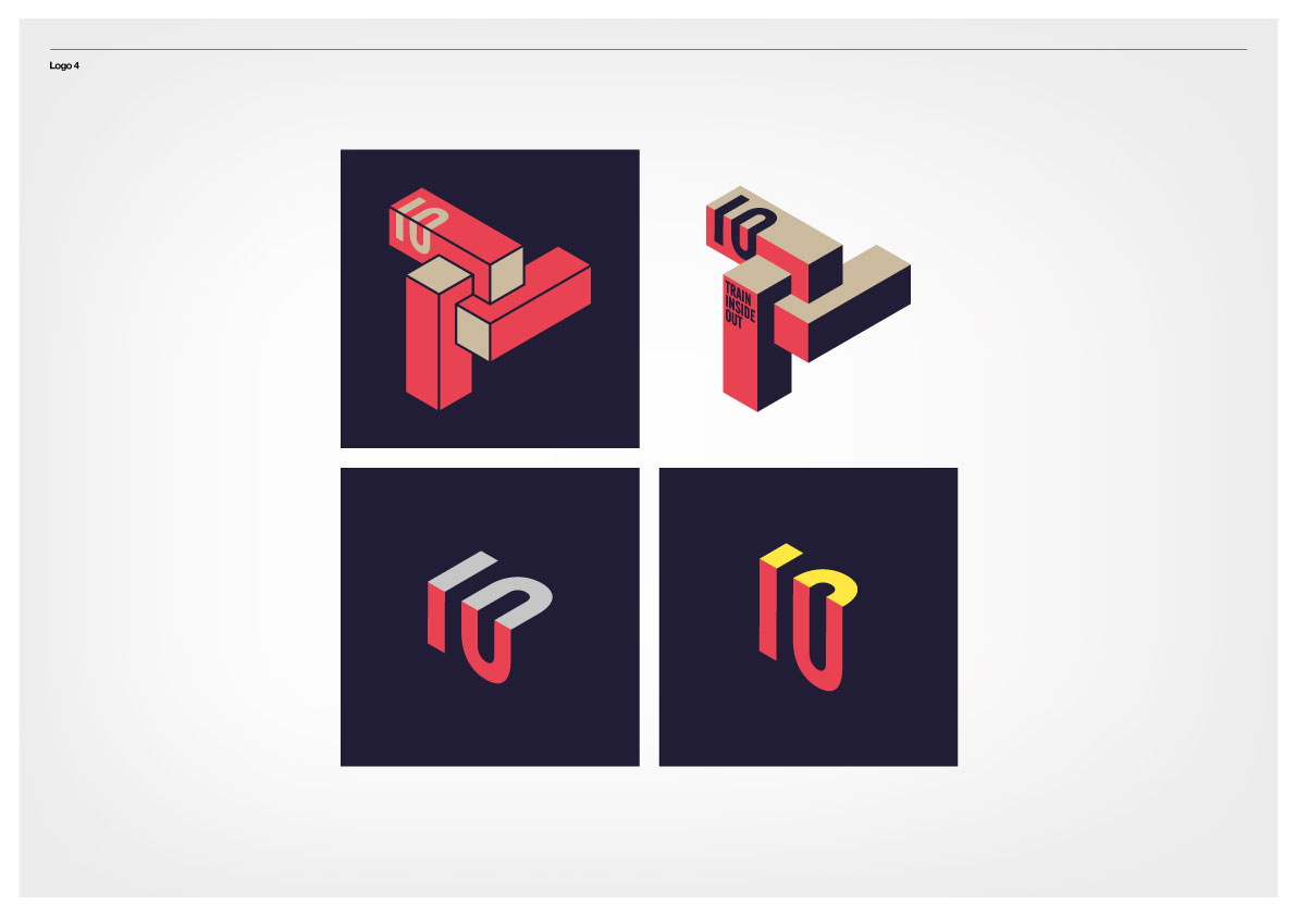
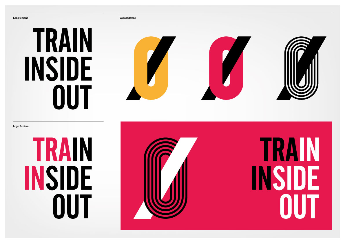
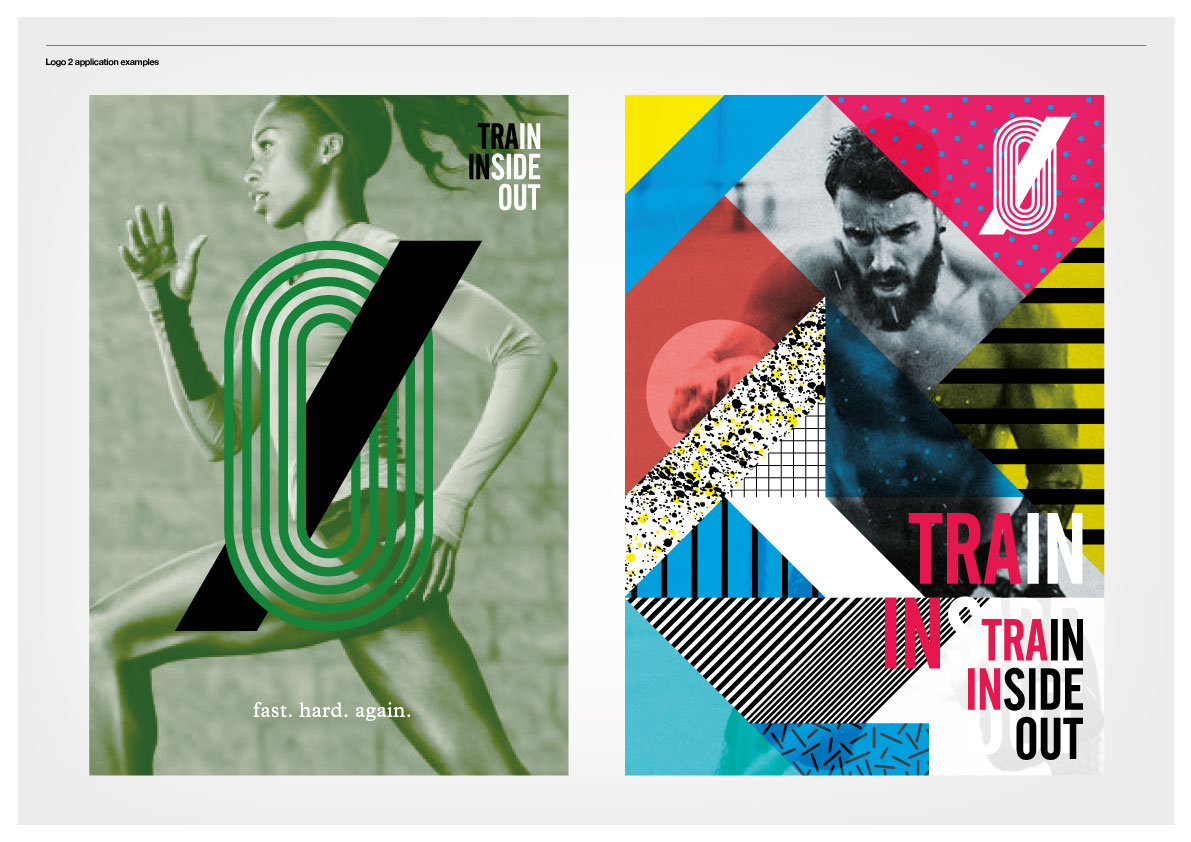
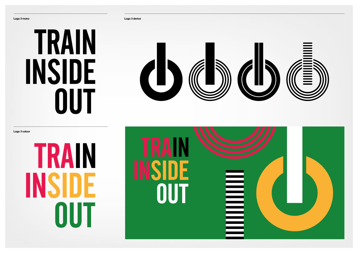
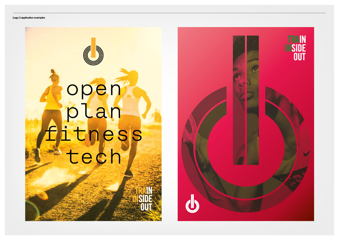
Initial brand identity design concepts
INSPIRATION
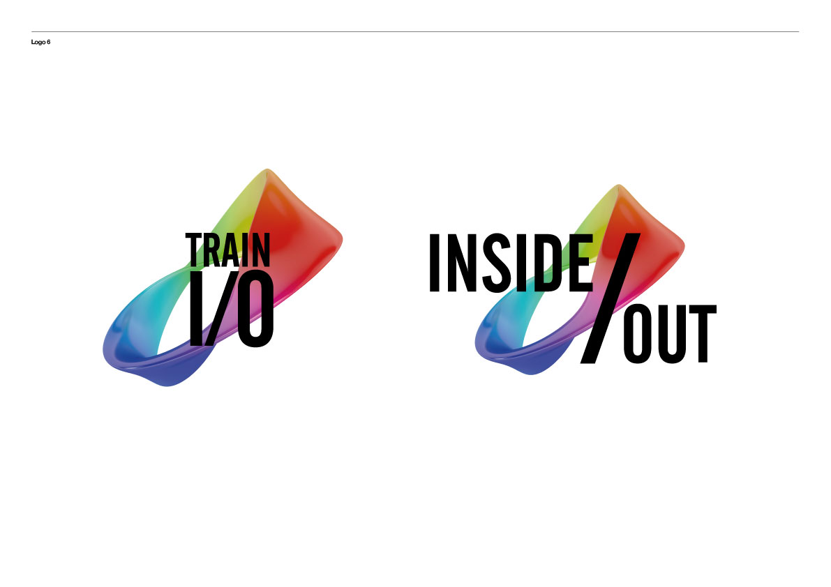
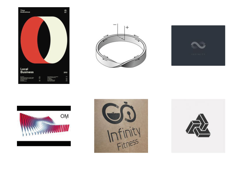
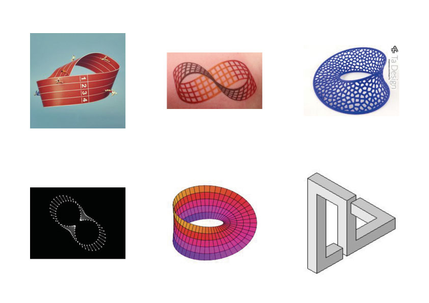
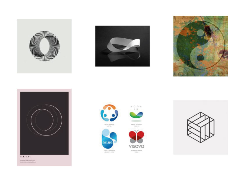
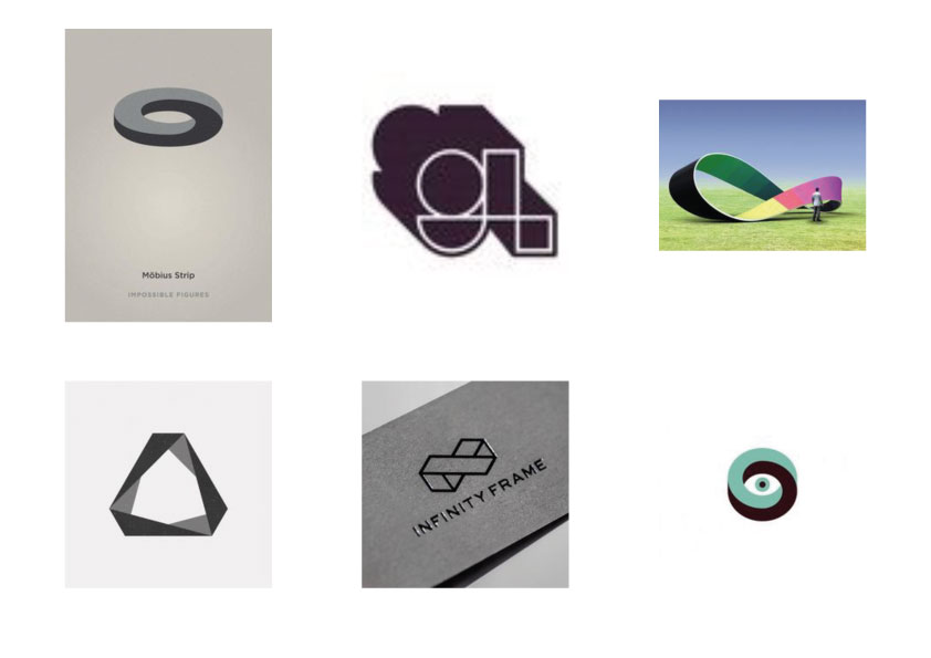
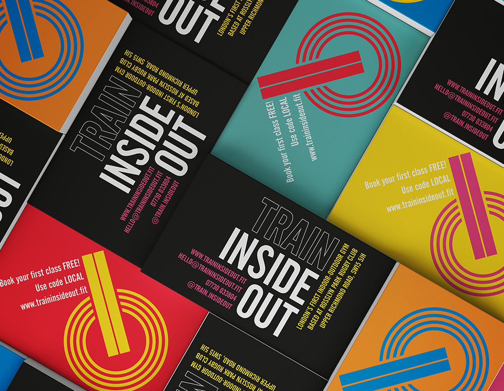
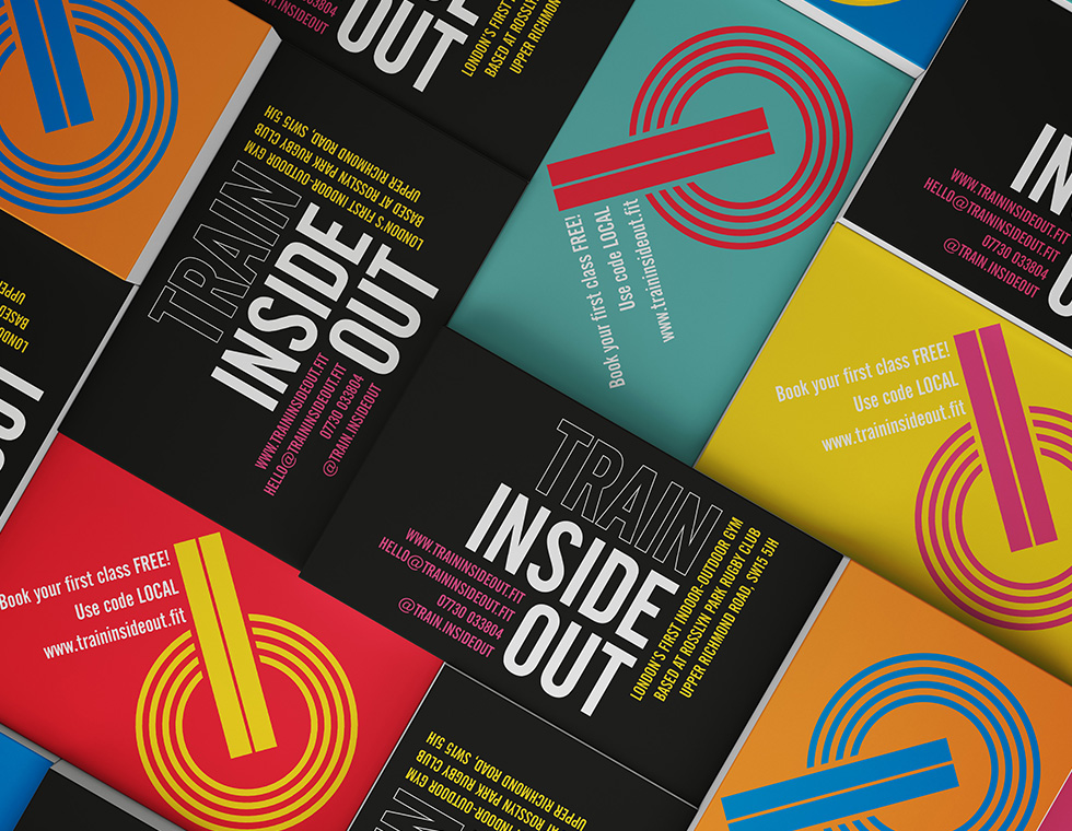
The Mobius strip provided the inspiration for the TIO marque
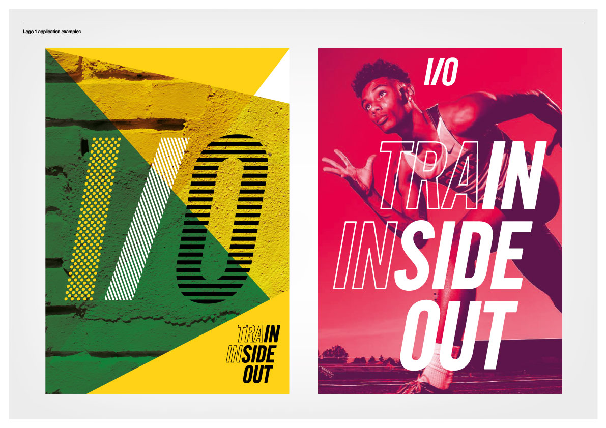
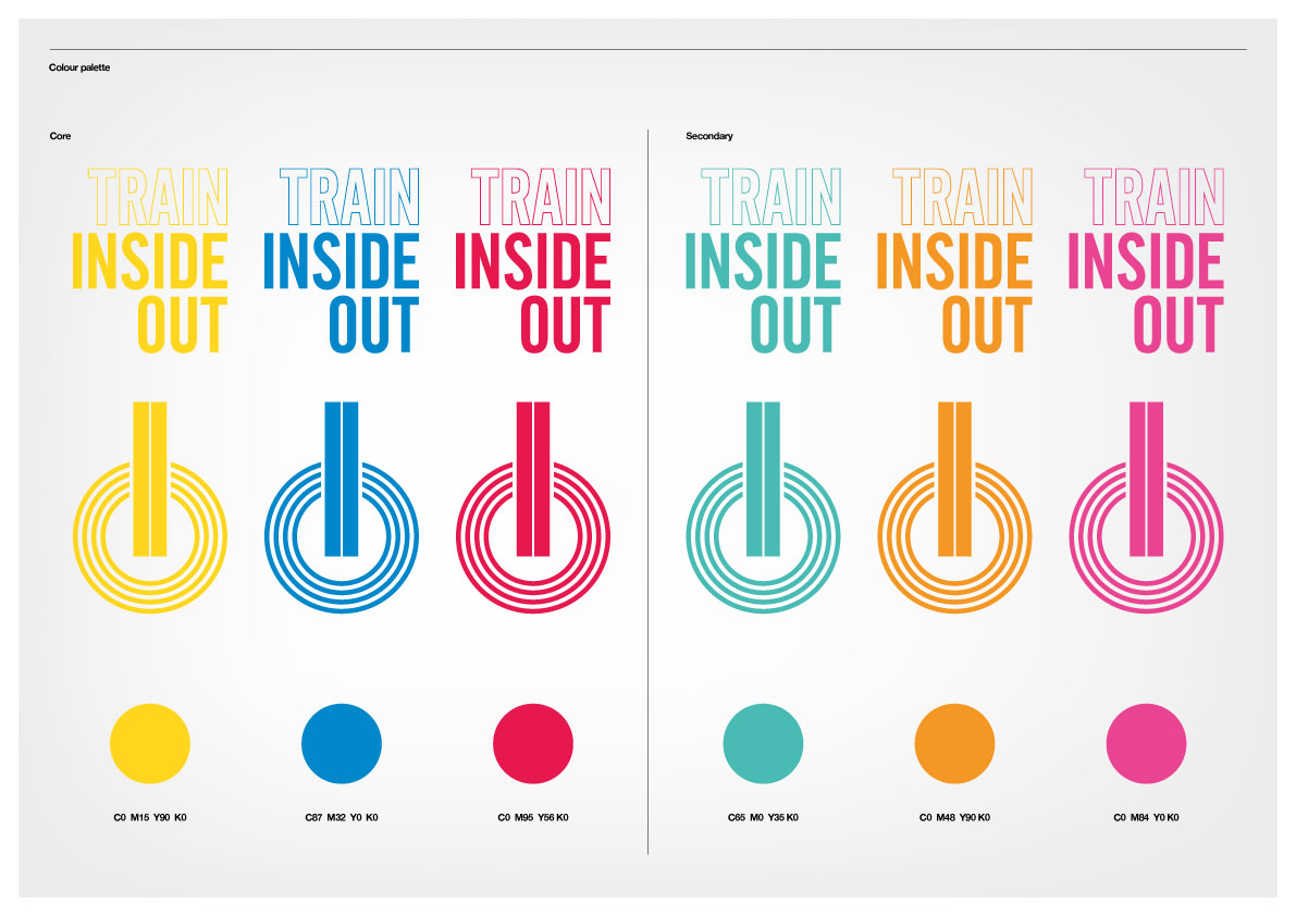
Final brand identity
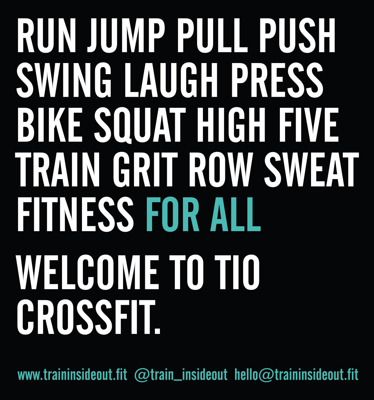
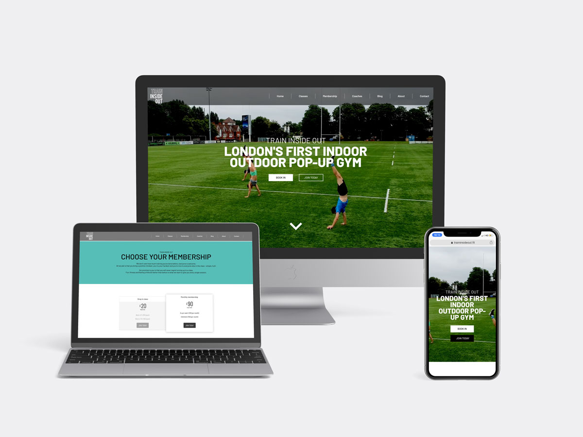
With a solid brand foundation in place, we then got stuck into developing the brand identity, website and signage for TIO. The final identity reflects the core values behind the brand amongst others fun, accessible, flexible, strong and confident. The Mobius Strip inspired marque is playful and reflects the inside out aspect of not only the brand, but the physical space itself.
When I first decided to open a new concept gym, I wanted to speak to Studio 6ix about my brand identity and website. They helped to create an identity which has felt like it was meant to be from day one. The whole process was interactive and clearly directed; giving me real clarity on what I wanted the company’s brand and values to be. Without their help I’d probably still be figuring out what name to use!
They seamlessly set up all the techie things I’m clueless about... website, emails, payment gateway SEO and so on. It took so much stress away and enabled me to get on with the things I needed to do to get the business up and running.
Holly Hammill
Founder & Head Coach
Holly has built an excellent reputation and a unique space with TIO, where everyone is welcome and feels part of a community, where every session is coached and people can train year-round through sun, rain and snow.
How can you help a 120-strong San Franciscan team design for an increasingly global audience from more than 200 countries? That was the challenge pitched to us by eBay.
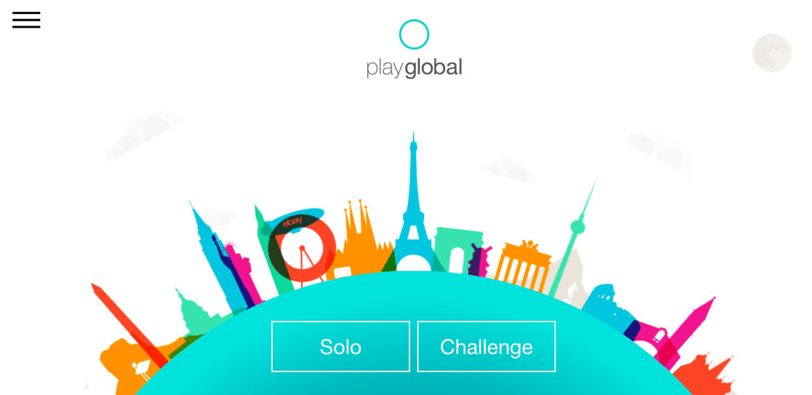
We spent time with the ebay team to scope out the problem, ask everyone lots of questions and host a series of rapid fire workshops with the eBay UX team. ‘Play Global’ was the answer.
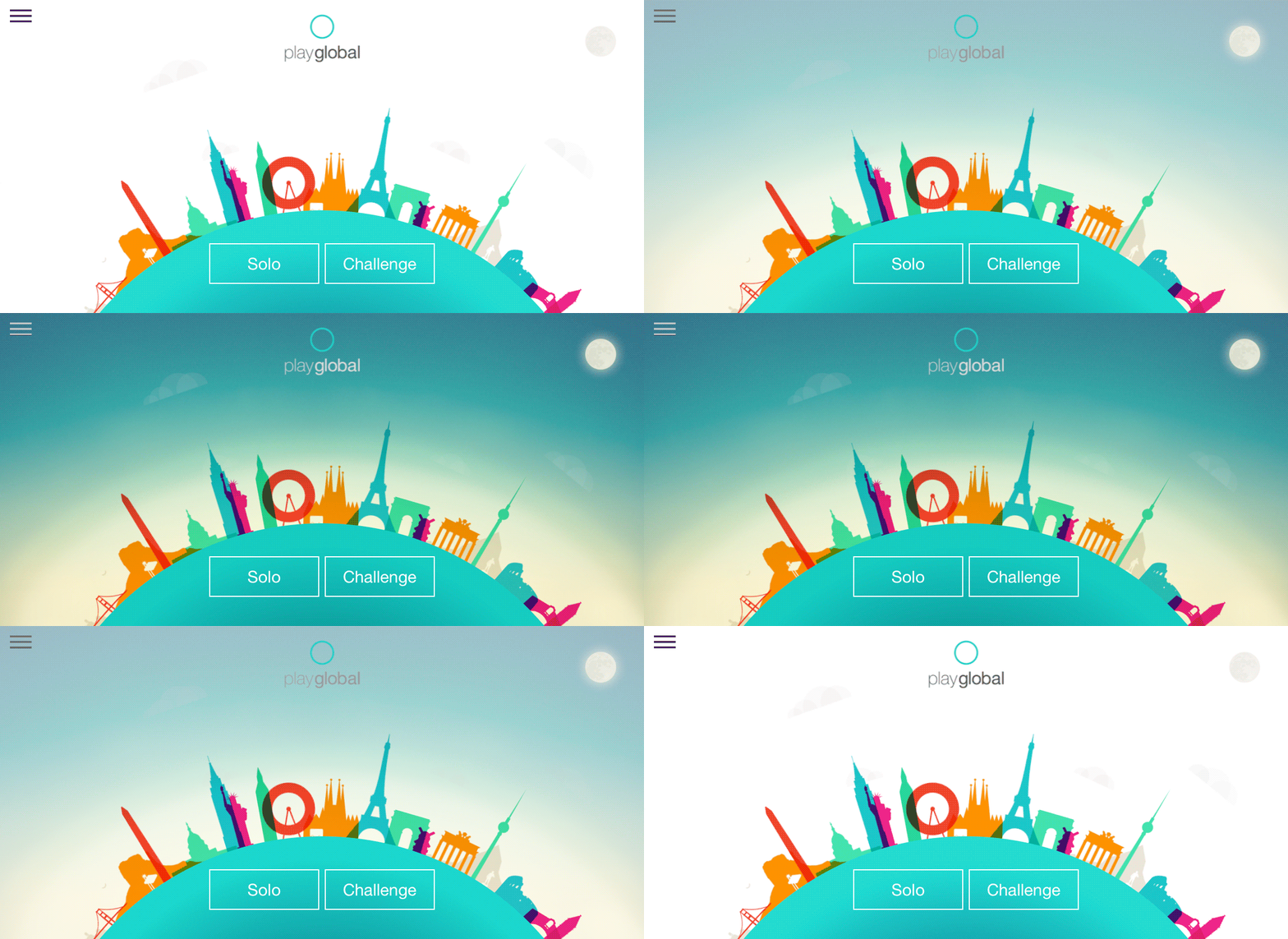
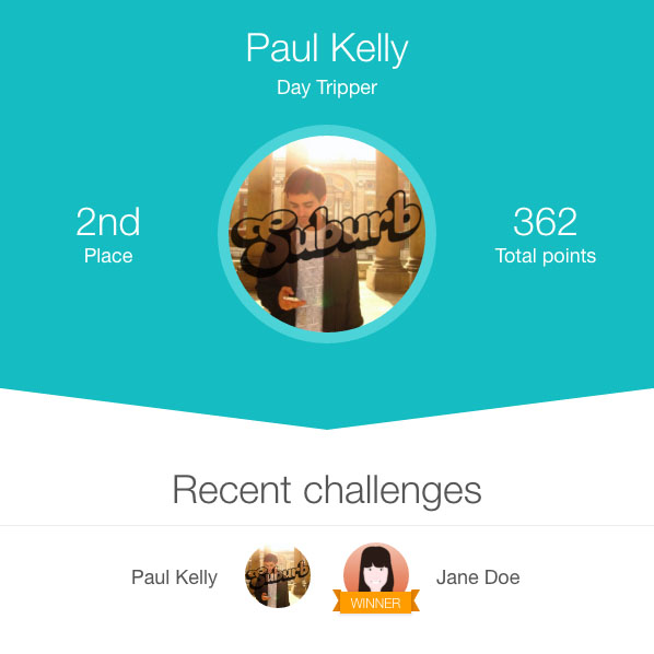
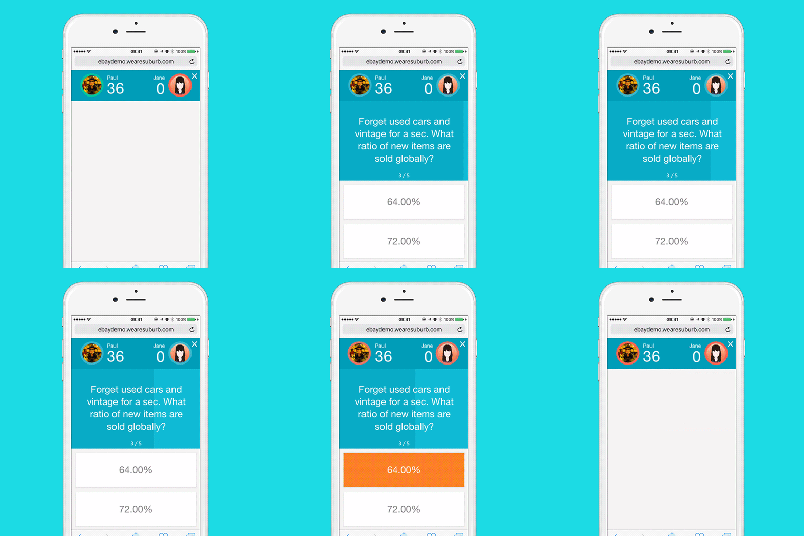
The game challenges users to expand their knowledge of life outside of the US. The designers can play solo or go head to head, working their way up a leaderboard from ‘day tripper’ to ‘native’.
If you find yourself in the Bay Area anytime soon, pop into eBay HQ and test your smarts on the large-scale version. Warning: You might not want to leave.
Concept workshops
User experience: Research, UX workshops, rapid paper prototyping, interactive prototype and user testing
User interface design
Illustration
Front-end development
Back-end development
A version of the game is displayed on a large kiosk in ebay’s San Francisco headquarters where anyone can step up and test their global knowledge.
"Everyone here thought the workshops went really well. They were hugely productive and we're really happy with where we’ve ended up after only three sessions. Bravo guys!”
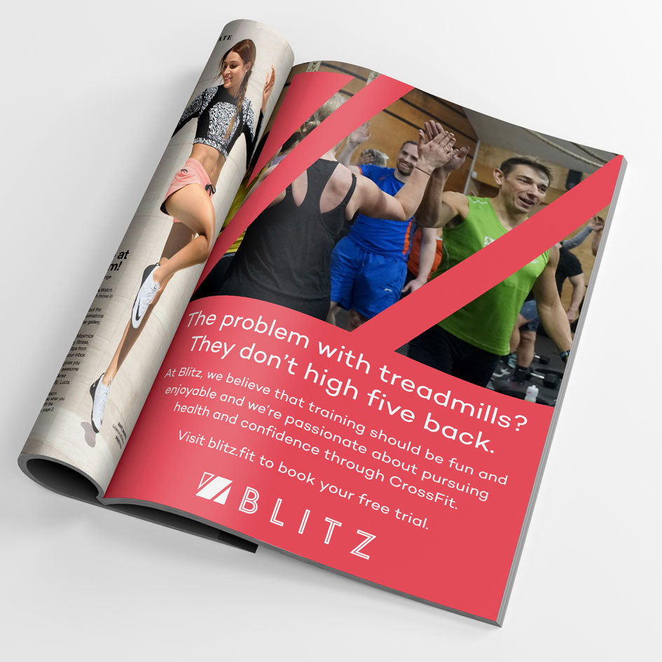
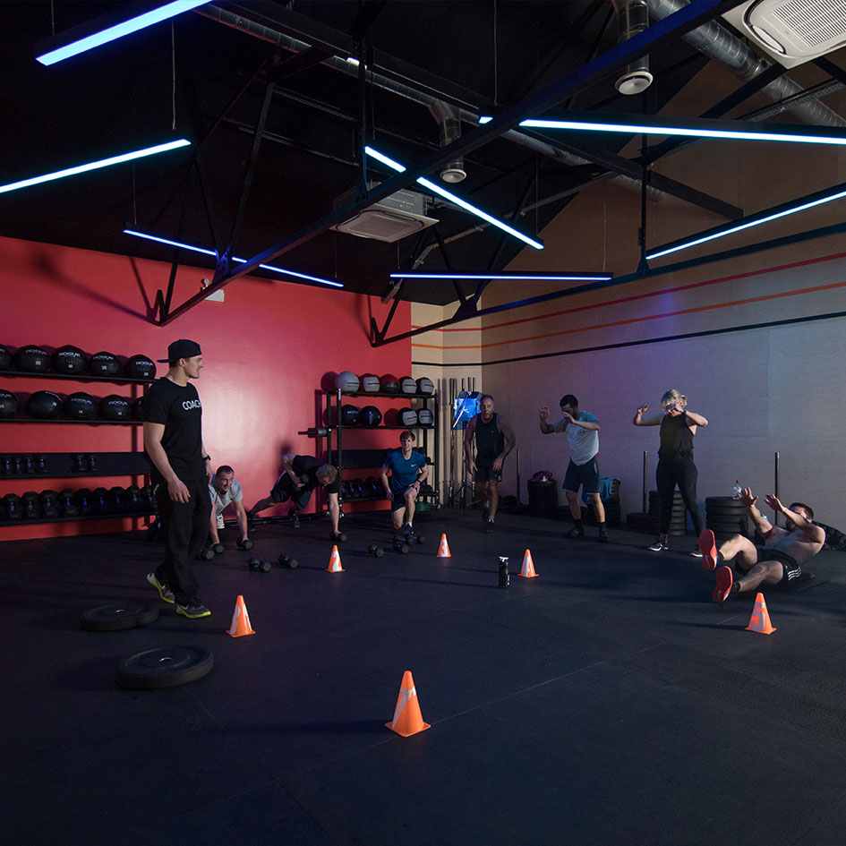
Having created the original brand for Blitz CrossFit back in 2013 the Blitz team enlisted us to rebrand and reposition the business.
Although the business was performing well, it was facing several challenges following a growing number of negative issues surrounding the CrossFit brand.
The core values by which CrossFit had originally been founded on still rang true to the team, after conducting some consumer research we discovered that a large part of the local market was intimidated by, and put-off by, the CrossFit image further cementing the decision to remove the word ‘CrossFit’ and set about rebranding.
Blitz had one goal; to alter the perception of the gym to that of a fun and engaging environment where people can get a sweat on, regardless of their fitness level.
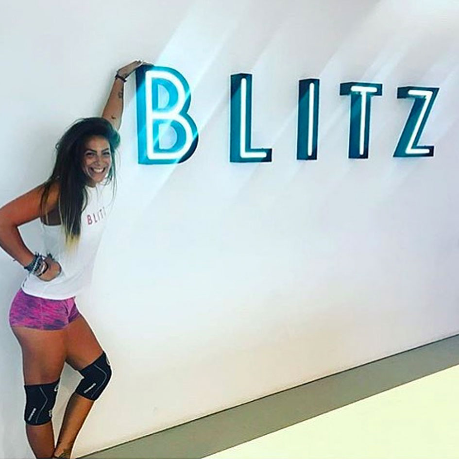
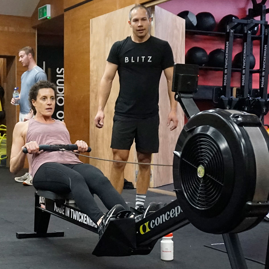
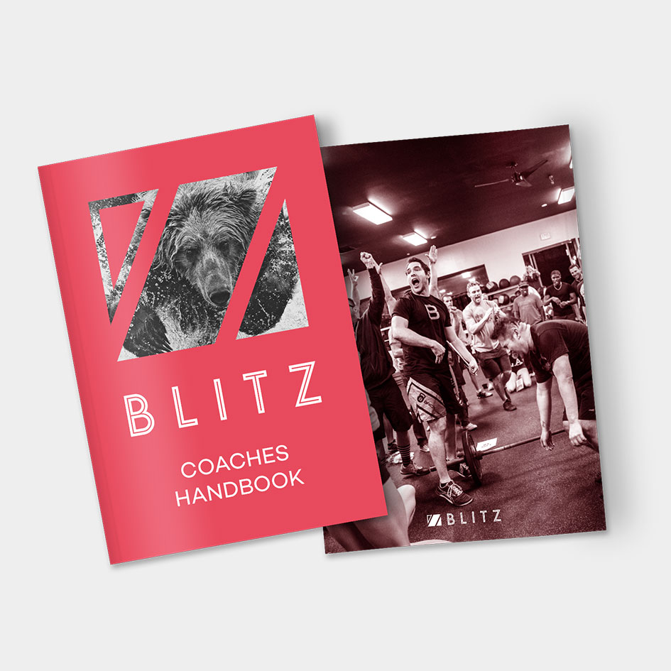
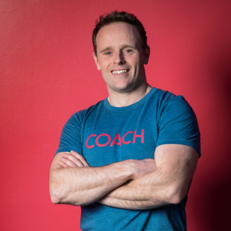
Studio 6 created a new brand strategy, new logo, identity system and worked on redesigning the interior and exterior of the building. Phil Parker serves as an advisory board member, creative consultant and spends a few evenings each week as part of the Blitz coaching team.
Brand Strategy
Brand Identity
Brand Guidelines
Creative Direction
Art Direction
Identity Implementation
Interior Design
Original Identity
Rebranded Identity
Our Custom designed titling font
45 Page Brand Guidelines
Studio 6ix have been instrumental in delivering Blitz as a brand. The care and attention to our business needs has been invaluable to us being where we are today. Thank you.
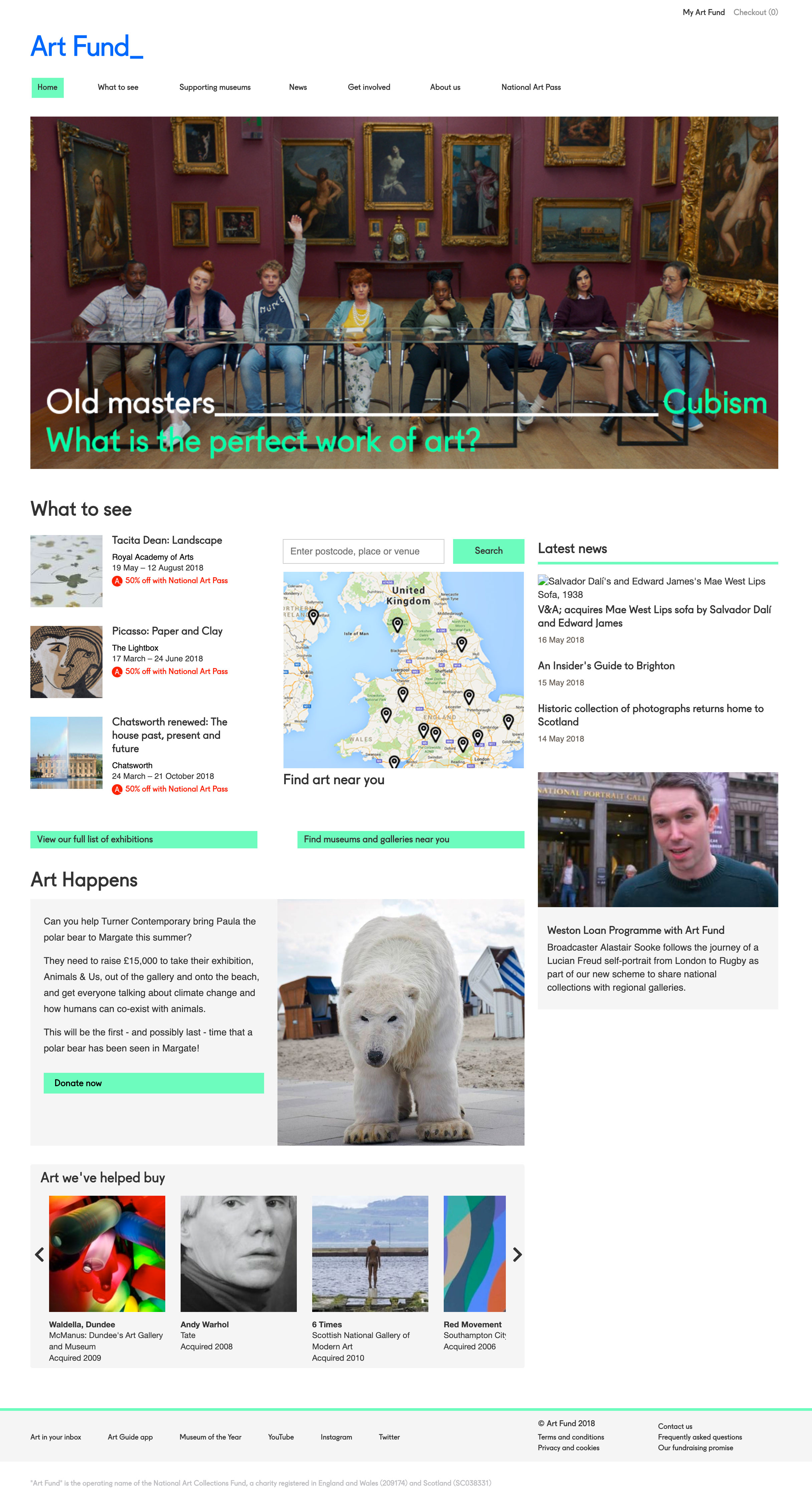
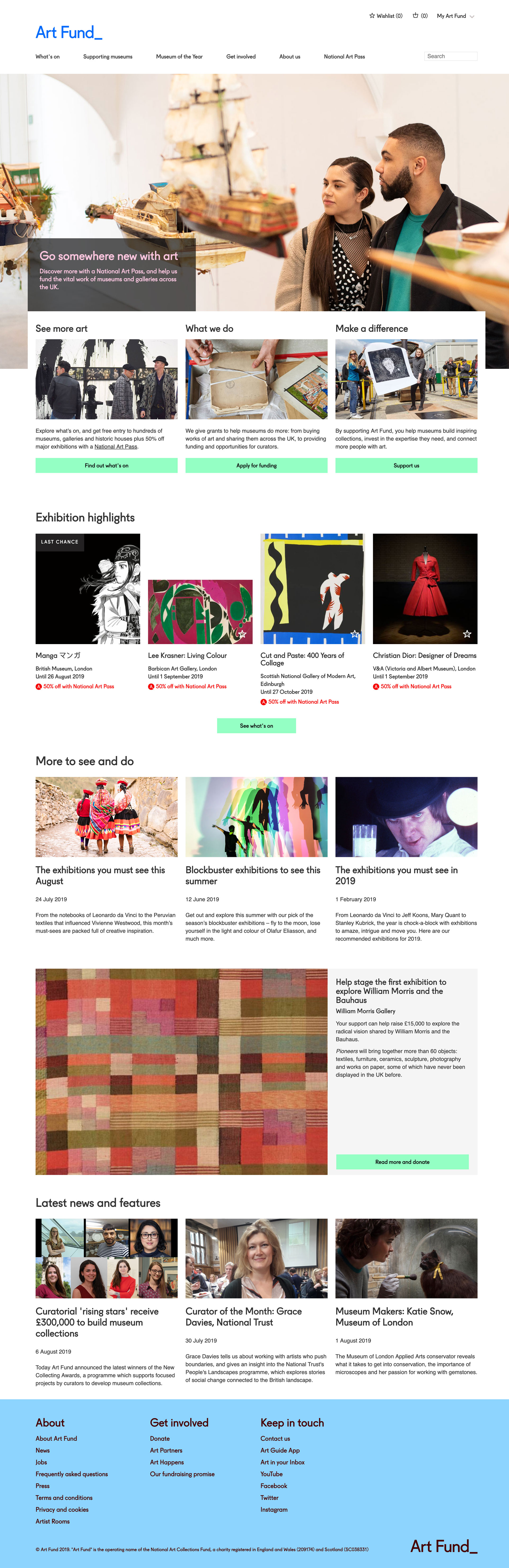
Following our successful work revamping the National Art Pass section of artfund.org, we received a new brief to redesign the homepage.
The brief: to offer a much simpler proposition to visitors. It should clearly articulate who Art Fund are and what they do; it should provide clear pathways to the main areas of activity; it should promote and provide a clear route for National Art Pass purchases and renewals; and it should allow the content team the flexibility to highlight key initiatives, campaigns and editorial content when required.
The issues and problems we needed to address were:
Multiple audiences: Art Fund is a multifaceted organisation providing a breadth of services to a variety of different audiences identified as; Culture seekers, Active Givers and Art Professionals.
Service organic traffic: Overall organic visits to the homepage have an 11% CTR; however this drops to 1.7% CTR when looking at unbranded terms
Footer: The footer could work much harder to signpost our different areas of activity
Information hierarchy: The current layout does not reflect organisational priorities or user needs
Navigation vs featured content: Must provide clear and consistent signposting while supporting discovery of timely content and changing/seasonal priorities
User Experience Research
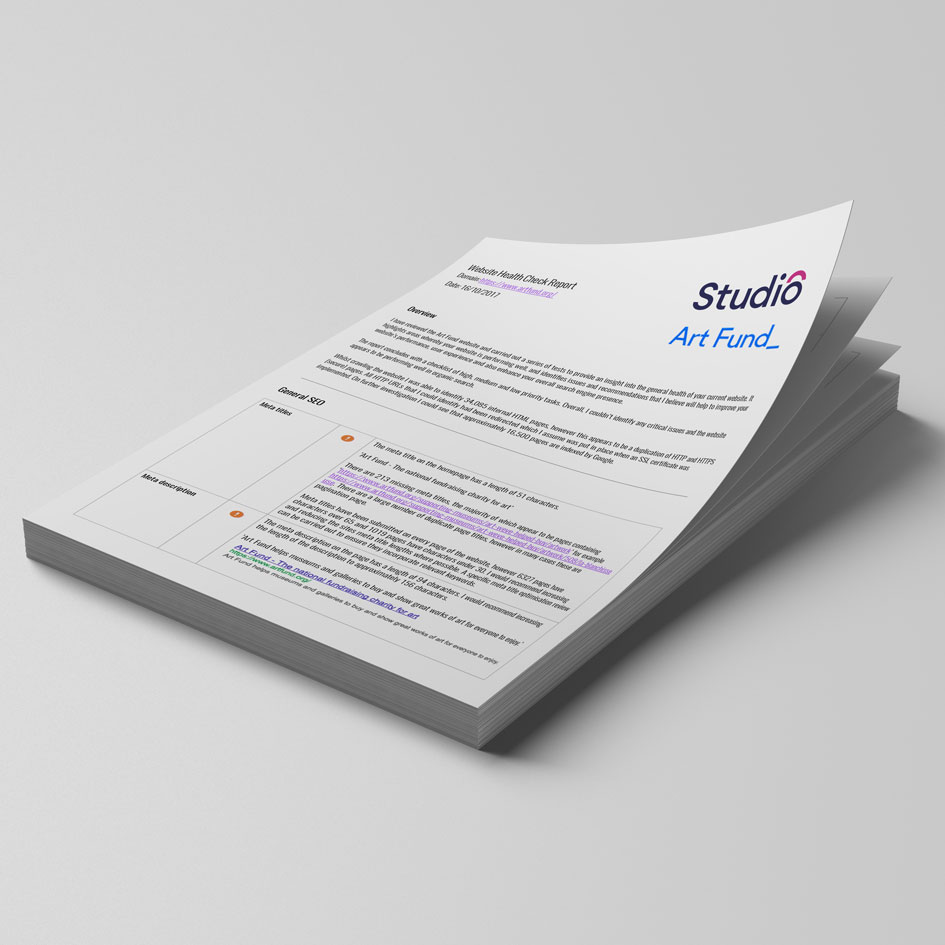
SEO Health Check Report
UX Workshops
User Experience Design
User Interface Design
Prototyping
User Testing
Functional and Technical Specifications
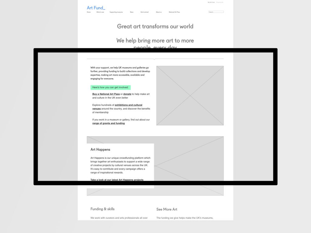
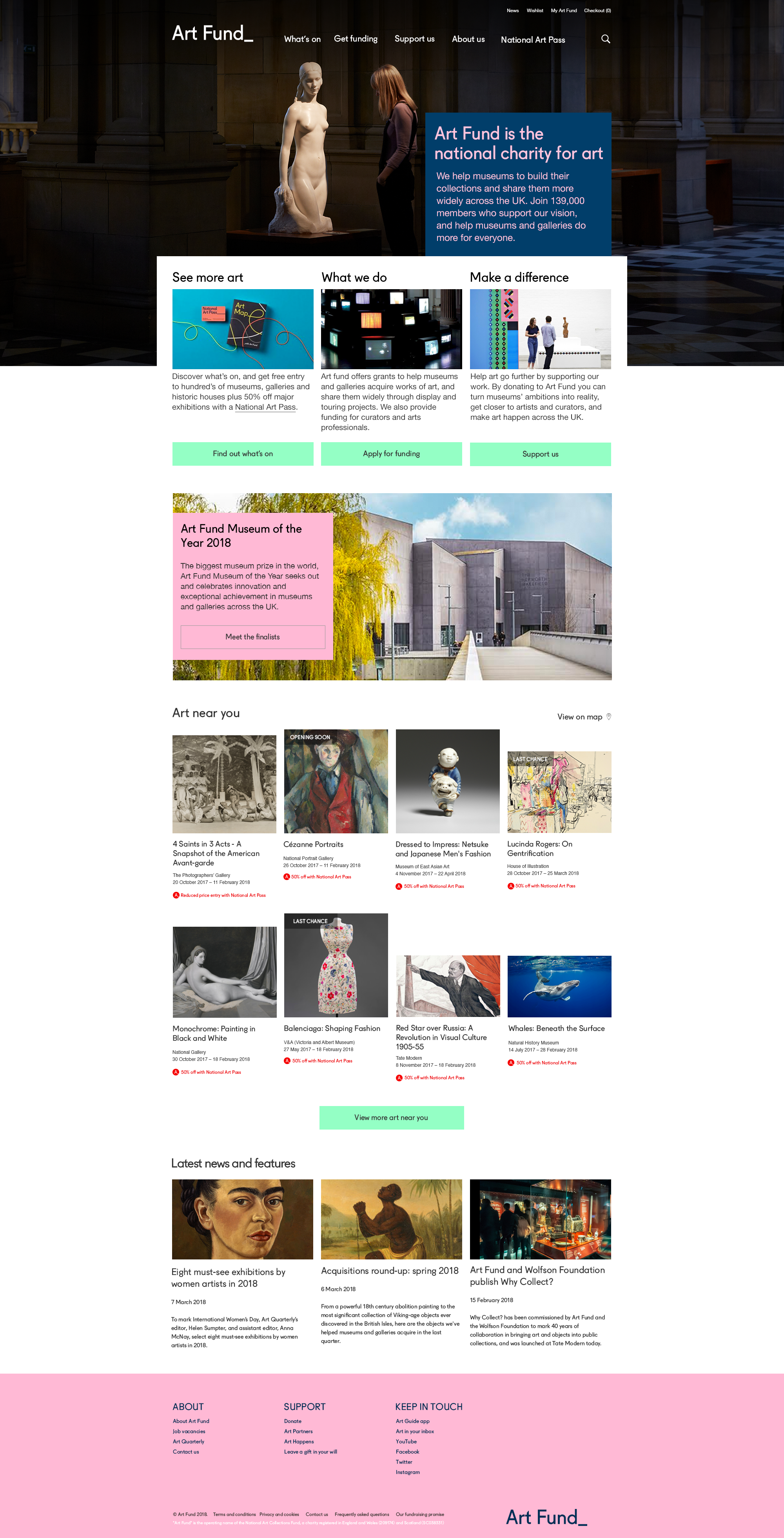
Mobile and Desktop Home Page before redesign —
Rollover image to scroll
Rollover image to scroll
First, we conducted an in-depth SEO audit giving us deeper insight into the performance and the broader health of the site along with a series of recommendations to take forward into the User Experience phase of the project.
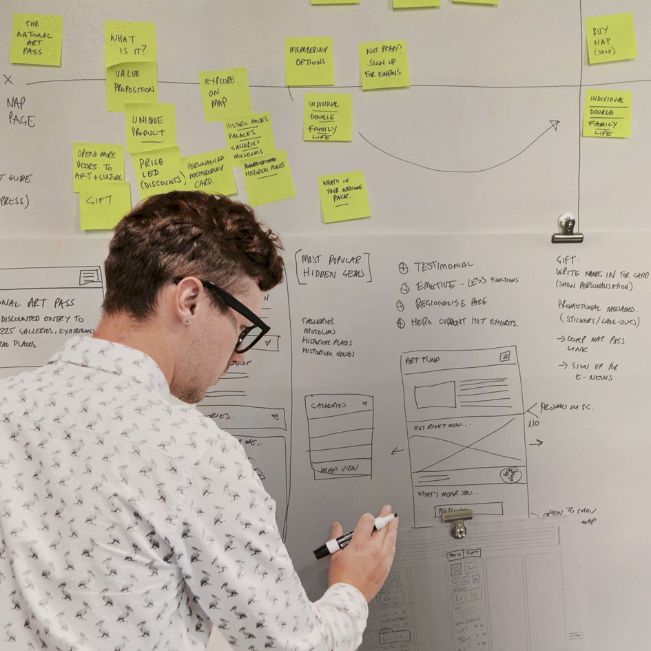
Two collaborative User Experience workshops conducted with Art Fund’s digital team mapped out the complete user journey, defined the brand experience, concept and eventual direction for the redesign of the new home page. A series of User Interface designs followed as (clickable responsive prototypes) which were then tested with the three identified audience types before arriving at the final and current homepage design.
Final UI designs along with functional and technical specifications were supplied to Art Funds web development agency for implementation.
KPI’s
Elevated the overall brand experience – closer alignment with offline visual branding
A homepage which clearly articulates Art Fund’s proposition as to who they are and what they do
Improved user journeys catering for Art funds three primary audience’s – Culture Seekers, Active Givers and Art Professionals resulting in increased traffic to key areas of the site
22% increase in revenue via the National Art Pass section of the site
Art Fund's Core Defined Audience —
Culture Seekers
I want to buy a National Art Pass
I want to use my National Art Pass
Active Givers
I want to be more involved through Art Happens or Art Partners
Donate
Art Professionals
I am looking for funding
I want to know more about how Art Fund supports professionals
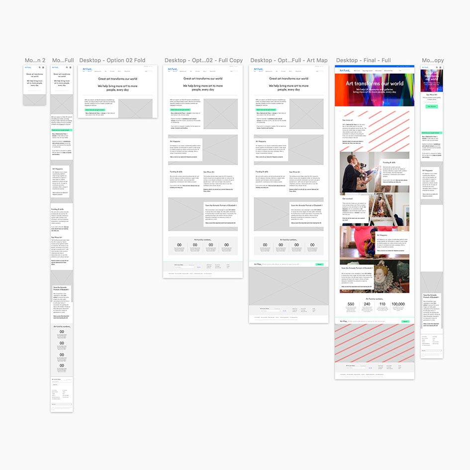
Redesigned Home Page Mobile and Desktop Prototypes —
Rollover image to scroll
Rollover image to scroll
Great UX and Design Effectiveness —
Increase
1%
of click throughs from Google Organic Search results to the new home page
Increase
1%
in visits to the What’s On section via the new home page
increase
1%
in revenue via online purchases of the National Art Pass
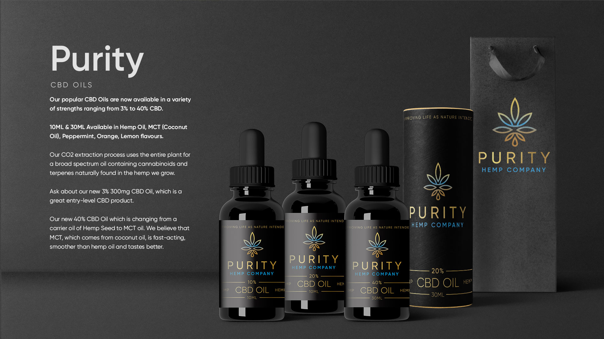
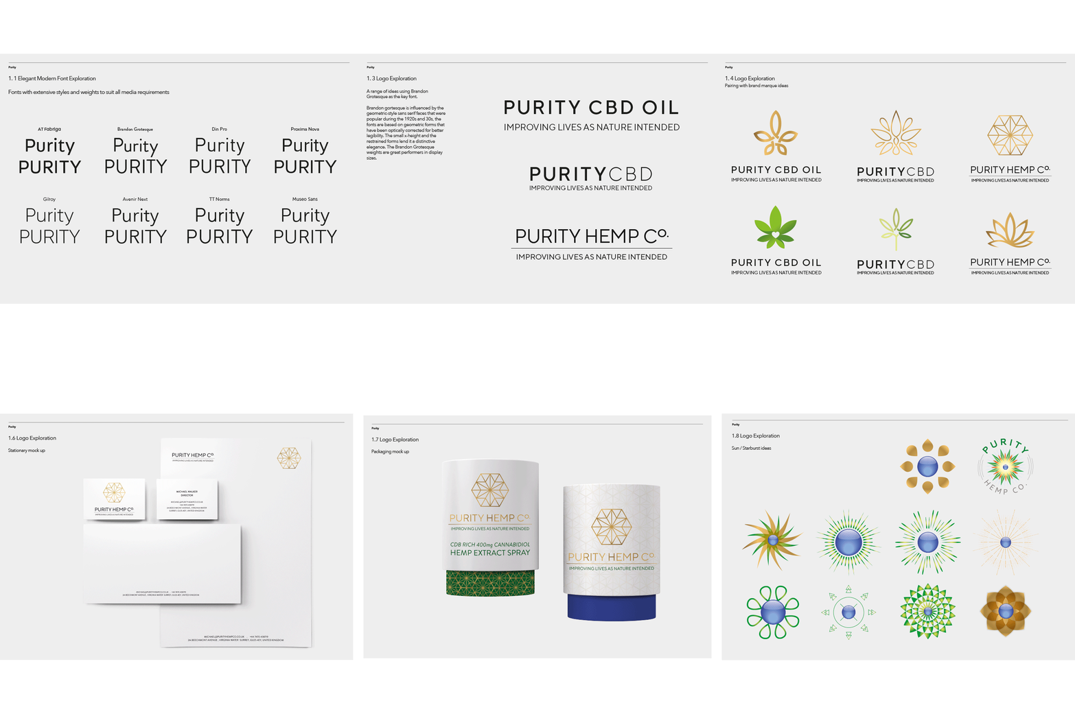
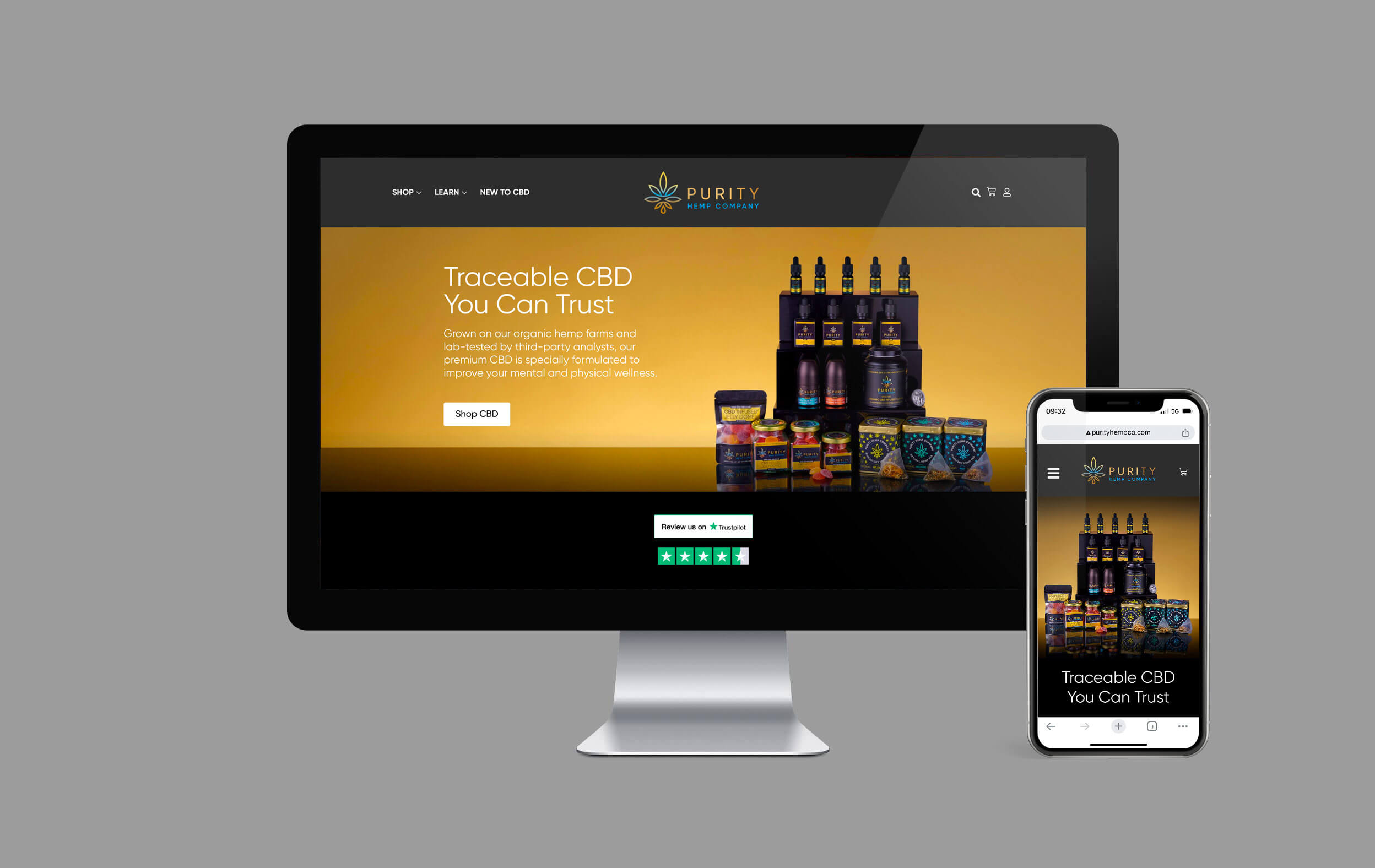
Purity Hemp Company enlisted Studio 6ix to develop their new brand identity system and retail packaging design.
A market leader in the thriving cannabis industry, Purity Hemp Company is a multifaceted, tech-forward cannabis and CBD extraction company based in the United Kingdom, Ireland, Netherlands, Italy, Canada and the USA.
This project is still evolving, but so excited are we about what Purity stands for, we wanted to share some of the work we’ve been producing to date.
Look out for Purity Hemp Company products and this space for further updates.